

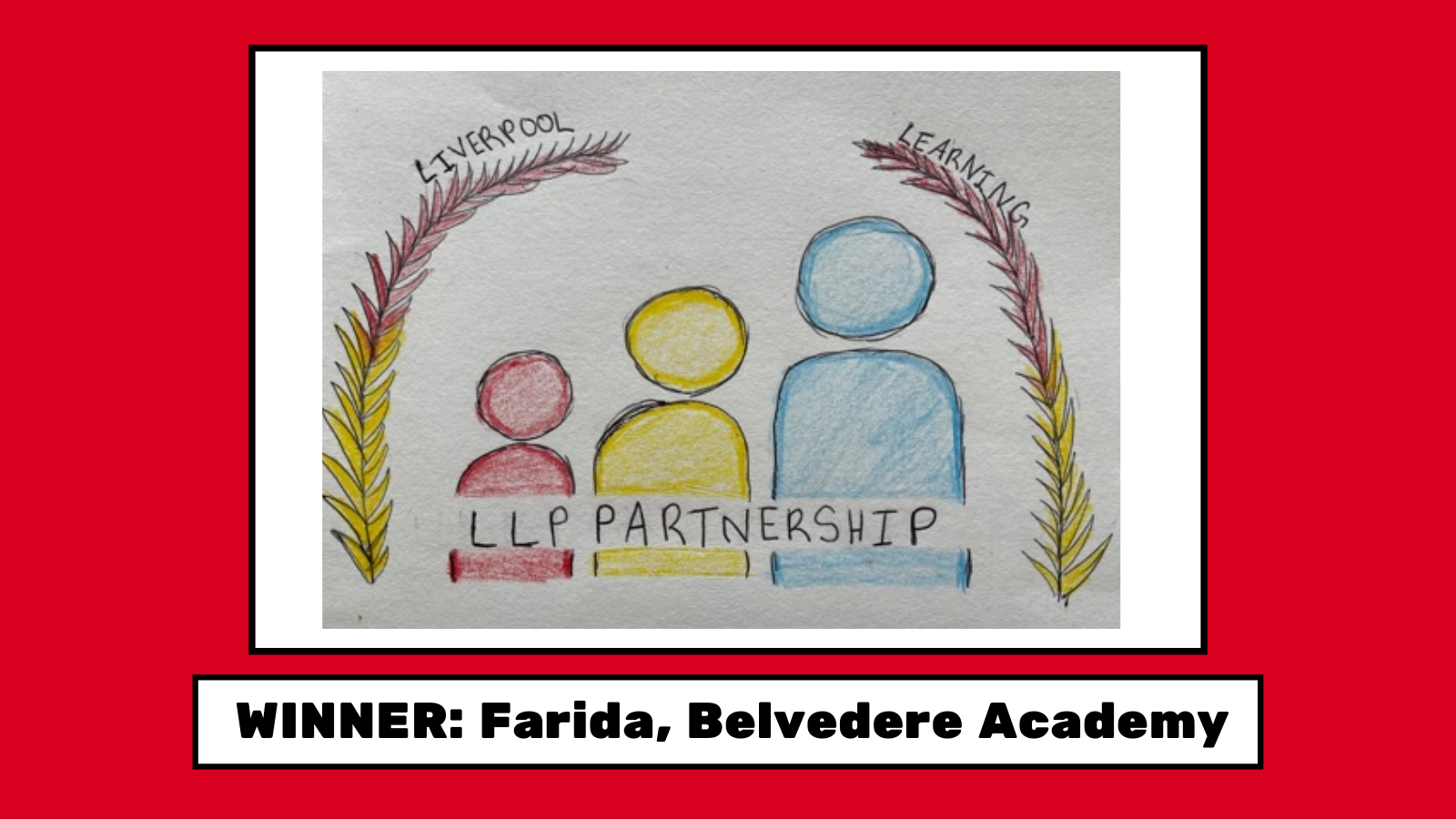
We ran a competition where pupils from across the city had the opportunity to design a logo that expressed the values and work of Liverpool Learning Partnership (LLP). The winning design was created by Farida, a Year 8 student at Belvedere Academy. She worked with Adam at Pixel Dynamic to turn her original design into a logo that could be featured on all of our communications.
We asked Farida to explain some of the design choices that she made when developing the LLP logo.
This logo was designed to show how the Liverpool Learning Partnership is one community working together. The people gradually getting bigger is a metaphor to show how they are gaining more knowledge and skills by being in the community. The leaves around the people show that it is a safe community that shelters and protects you. The people are very neutral showing that everyone is welcome.
The primary colours show that learning gives you primary, important knowledge that you can make whatever you want with- there is no limit to what you can do! It shows that you can do so much with these primary colours just like you can do so much with the information you are given to learn in schools.
The font is bold so it shows that LLP is a large family of schools. Finally, the LLP on the people show that we all represent Liverpool Learning Partnership with our hard work and dedication.


 Design by